TNS news nishikie
Two series, four stages
By William Wetherall
First posted 1 August 2005
Last updated 1 February 2010
Periodization and style
Two series
|
Four stages
|
Three cherubs
|
Two Tokyos
|
Variations and exceptions
Series 1 banners
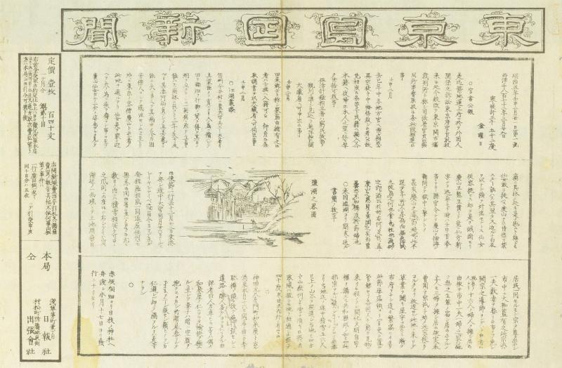
Promotional flyer: Summer 1874 flyer
|
Stage 1: 1874-8 to 1874-10
|
Stage 2: 1874-10 to 1875-8
|
Stage 3: 1875-8
Series 2 banners
Stage 4: 1876-11/12
TNS periodization and style
At first glance the designs of the Tokyo nichinichi shinbun nishikie (TNS prints) look the same, in that they show two cherubs upholding an unfurled banner with the name of source newspaper on the banner. However, a closer look will show numerous variations.
An even closer examination will reveal that some of the variations in the cherub and banner designs correlate with variations in other elements -- such as publication date and issue number. In fact, TNS prints can be divided into two series based on publication date and theme, and four stages reflecting banner designs.
Two series
TNS prints can be divided into two broad periods in terms of publication date, drawer, and theme. I am calling prints published during the first period "Series 1" and those that came out during the second period "Series 2".
Series 1 prints were published between August 1874 and August 1875. All of the 108 prints in their series were drawn by Yoshiiku, and all but one were published by Gusokuya. Their themes are drawn from the full sprectrum of human life.
Series 2 prints were published in November and December 1876. All were published by Gusokuya, but three were drawn by Seisai Yoshimura, and one -- which is probably not part of the series -- was drawn by Hayakawa Shosan. All were about the civil disturbances that preluded the outbreak of the Seinan War in January the following year.
Four stages
Series 1 prints can be broadly divided into three stages according to the design of their banners, in particularly the the orientations of the cherubs holding them up, but also other features. I am calling these stages Stage 1, Stage 2, and Stage 3.
Series 2 prints have banners of various designs that I am calling Stage 4 -- mostly to give them a name. The series consists of only four prints, only three of which have cherubs and banners. The cherubs are Stage 2 and the banner is Stage 3. The fourth print is probably not really part of the series.
Three cherubs
In all four stages, the cherub to the right of the banner -- as we look at the print -- is generally looking toward his right, possibly at his buddy to our left. More likely, though, he is reading the banner -- which reads from right to left.
In other words, the print begins in the upper right corner. And the cherub stationed in this corner is inviting us to read the banner -- Tokyo nichinichi shinbun.
The cherub on the left, however, experiences three mood changes during the run of the main TNS series -- reflected in the three different directions in which he is looking. The orientation of this cherub's face and eyes correlates with other elements, including the date of publication and issue number .
See TNS cherubs and seals for an analysis of cherub / seal correlations.
Some physical features -- eyebrow thickness, whether the corners of the mouth are turned up or down, how much hair is on the head and its color, for example -- vary within, and across, the cherub designs that define the broader stages of prints.
The colors on the left and right of the banner not only vary across the series -- but also vary with different printings of the same issue.
See TNS print variations for examples of variations of TNS prints.
Stage 4 cherubs resemble Stage 2 cherubs -- but Stage 4 banners incorporate one of the more conspicuous features of Stage 3 banners -- their use of 東亰 rather than 東京 for "Tōkyōo".
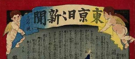
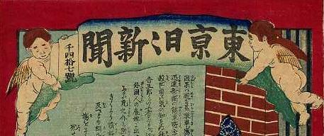
Two TokyosStage 3 prints are characterized not only by their cherubs, but also by their bold calligraphy, which emulates the masthead of the source newspaper -- including its use of 東亰 rather than 東京 for "Tōkyōo". The city that replaced Edo in 1868 has been called "Tōkyōo" or "Tōkei" and written 東亰 or 東京. Today the city is usually called "Tōkyōo" and written 東京 -- but 東亰 can be seen on older brass plates, and has a calligraphic patina that invites usage even today to create an air of antiquity, however artifical. |
||
Tokyo nichinichi shinbun was launched in 1872 as a woodblock-printed paper under a masthead that read 東亰日日新聞. The characters 日日 were stylized as 眞 and 正 inside 口口 -- meaning that the "news" (新聞 shinbun) was "true and accurate" (真正 shinsei). 真正新聞 is still a common expression today -- in Chinese -- for authentic, veracious news. The stylized characters were dropped in favor of just 日日. But even after the paper switched to metal type, its masthead continued to be printed by using plates engraved from brushed calligraphy using 東亰 rather than 東京. Tonichi continued to be published under such a masthead until it became Mainichi Shinbun in 1943. Tokyo Asahi Shinbun also used 東亰 in its calligraphic mastheads until after World War II. |
||
|
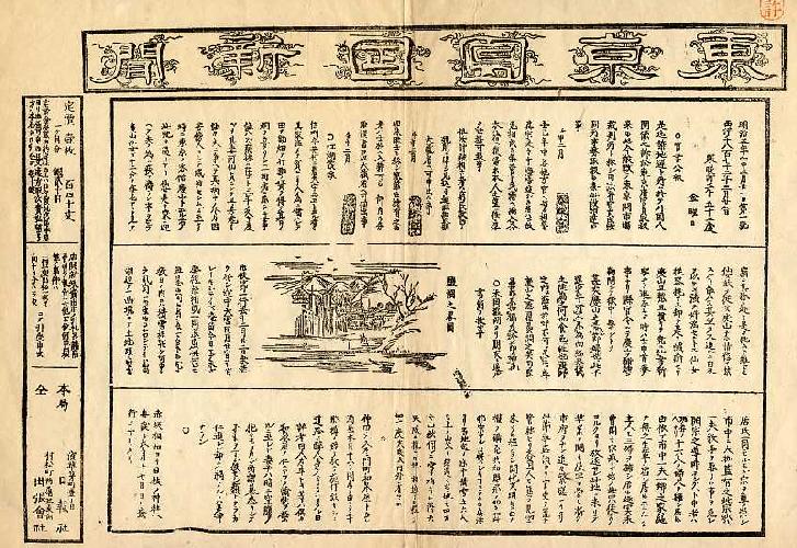
Metal-type representations of the name of the paper, however, were 東京. Formally the paper was called 東京日日新聞, though the colophons of books published by the newspaper company sometimes used 東亰. The masthead, whether written horizonitally or vertically, used 東亰 and 日日 (Figures 1 and 3). Titles inside the paper, however, were likely to reduce 日日 to 日々 (Figure 1). Supplements distributed with the newspaper were also likely to reduce 日日 to 日々 or even 日〃 (Figure 3). Tonichi's original standard was a highly stylized 東亰日日新聞 that ran from right to left across the top, like that of the first issue. By the end of 1872, when Japan officially shifted from the lunar to the solar calendar, Tonichi was printing its standard 東京日々新聞 down the right side -- in other words, more simply and veritically. 東亰 gave way to 東京 and 日日 became 日々. The font of the new verticial standard was that of a brush style. The standard kanji ditto mark 々 -- a cursive form of 同, which means "same" -- was represented by a further reduction that looks like a reversed 〃. By no later than the end of 1873, the font had become that of an angular style with the standard ditto mark. This style was closely emulated on Stage 1 and Stage 2 TNS banners. By no later than the spring of 1875, Tonichi had gone back to using 東亰日日新聞 for its standard, written horizonitally in a bold brush style. Though the name of the paper might be written 東京日々新聞 elsewhere, the formal standard remained the boldly brushed 東亰日日新聞 until Tonichi's demise in 1942. Wood blocks, metal type, wood typeIt took Tonichi the better part of a year to make the translation from wood blocks to metal type. The evolutionary trail was not straight, but turned back on itself and meandered. (Mainichi 1972:422-428, and color plate in front matter) Issue 1 by wood blocksIssue 1 was published from wood blocks in the conventional way. Its standard (at the top) and its colophon (to the left) were printed in a dark brown. The articles and an illustration were black. The characters 官許 (kankyo), meaning that the paper was officially approved, was stamped in vermillion on the edge of the standard in the upper right corner. Issues 1 through 372 were printed on washi. Only about 1,000 copies of Issue 1 were made. A number of reproductions of Issue 1 were made, some of them on washi about the same size -- roughly 46 cm wide by 31 cm tall. The images shown in publications are likely to be of reproductions. The images shown in Mainichi Shinbun's 100th aniversary publications are of genunine copies. The image shown in Newspark 2000 appears to be of a reproduction. Issues 2-11 by lead typeIssues 2 to 11 were published on a foot press from Shanghai using a Mincho font lead type. But the publishers went back to wood blocks from Issue 12. Nipposha announced that it was discontinuing the lead-type press because, with Issue 11, it had used all the paper it had preprinted with the Tonichi standard and colophon. They had used the press and lead type to commemorate Tonichi's start. Apparently the new technology proved to be too labor intensive and limiting. (Mainichi 1972:426-427). Nishioka Kosuke, one of Tonichi's founding publishers, gave his account of what happened in an article that ran in the 29 March 1909 edition (Issue 11,599) of Tonichi entitled "The first moveable type" (最初の活字). The edition was a special issue celebrating the 37th anniversary of the paper, four years before its merger with Osaka Mainichi. (Mainichi 1972:426) Indeed, Issue 11 shows all manner of irregularities that resulted from an insufficient supply of type. When they ran out of type for certain kanji, they had to swap in katakana. When they ran out of a certain size, they had to swap in a different size. They even resorted to different kanji. So high-frequency characters like 月 and 銀 became ゲツ and ギン. (Mainichi 1972:425) There is also evidence of swapping katakana for kanji that apparently existed in sufficient supply -- possibly because the typesetter couldn't immediately find the kanji in the unfamiliar Nanking case box. The situation was truely a nightmare for typesetters and readers alike. The only remedy was to go back to the tried-and-true familiar wood block woodblocks -- which impossed no limitations on availability of suitable type. Issues 12-117 by wood blocksFrom Issue 12, and for about four months, Tonichi publishers returned to using wood blocks -- the technology they knew like. The standard and colophon of Issues 12 and 13 were dark blue. For Issues 14 to 16 they were light a blue close to light green, and for Issues 17 to 29 they were the same brown as the Issue 1. Everything because just black from Issue 30. The characters 官許 (kankyo), meaning that the paper was officially approved, were printed in vermillion on Issues 21 through 29. (Mainichi 1972:427) Issues 117-303 by moveable wood typeTwo features of particular interest are boxed remarks on "Toukei nichinichi" (page 571) and the ways in which Tonichi's name was written on its masthead (page 572). For a full discussion of these two topics, see Tonichi mastheads: Graphic changes in printing technology. (WW) | ||
| ||
| ||
"Tōkyō" and "Tōkei"CCMA 2008 states that "東亰 (とうけい [tōkei]) is a different name for 東京 that was used until the middle of the Meiji period, but gradually it came not to be used" (page 79). This statement, though, is very misleading. The character 亰 was merely a popular variation of 京. The character 京/東 can be pronounced kyō (kiyou, kiyau;), kei, and kin -- its three Sino-Japanese readings in chronological order -- its Go (Wu = pre-Tang), Kan (Han = Tang, Chang'an), and Tō (Tang = Song, Yuan, Ming, Qing) readings. Both 東京 and 東亰 could be pronounced either "tōkei" or "tōkyō". People most at the time probably called the city Tōkyō and read both 東京 and 東亰 the same way. The continued use of 東亰 on the Tonichi masthead -- and then on Stage 3 TNS banners -- was merely a graphic affectation. In fact, 東亰 contininued to be use in the Tonichi masthead -- and in stylized colophons of the name of the newspaper company in other Tonichi publications -- until the paper became Mainichi Shinbun from 1 January 1943. Today, 京 is read "kei" in many compounds -- including 京浜 (Keihin) -- an abbreviation of 東京・横浜 (Tōkyō-Yokohama). SourcesMainichi Shinbun Hyakunenshi Kanko Iinkai |

Variations and exceptions
| Four stages of TNS news nishikie cherub and banner designs |
|
|
|
Series 1 TNS prints Summer 1874 to August 1875 |
|
|
|
Promotional flyer Summer 1874 |
||
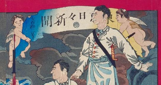
The nishikie to the right is a hall of mirrors in that it becomes a promotional flyer by showing a picture of a promotional flyer. The title of the flyer is Tokyo nichinichi shinbun onishiki announces a forthcoming series of nishikie based on stories in the newspaper Tokyo nichinichi shinbun. Name of newspaperThe banner and the text on the print refer to the source of the forthcoming 大錦 (ōnishiki) series as 東京日日新聞 (Tōkyō nichinichi shinbun) and 日日新聞 (Nichinichi shinbun). However, all banners of the nishikie series show variations of the title 東京日々新聞 (Tōkyō nichinichi shinbun). In other words, 日日 (nichinichi) refers to the newspaper, whereas 日々 (nichi ditto == nichinichi) refers to the nishikie. CherubsThe cherub on the left is looking down and to his left -- at the text if not at the other cherub. The cherub on the right is looking to his right -- apparently at the text. Here the cherubs are holding up the pictured flyer. In the nishikie series, they are featured on the masthead, where they hold up the title banner. The styles of the cherubs somewhat changed as the series continued, and the variations can be used to estimate the order in which certain of the prints were published. |
|
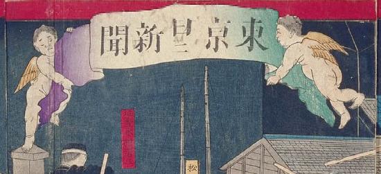
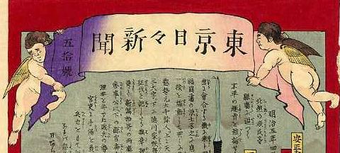
Stage 1 TNS banners August 1874 to October 1874 |
|
On Stage 1 mastheads the cherub on the left is looking down and a bit to his right (our left). 22 TNS prints feature this style of cherub. 17 (77 percent) have approval seals, all for months in 1874 (Meiji 7) -- including 2 Meiji 7-8, 6 Meiji 7-9, 7 Meiji 7-10卍, and 2 Meiji 7-10X. All prints with Meiji 7-10卍 seals are associated with this group. Only 5 prints (23 percent) have no seals -- the lowest no-seal rate of all stages. However, the average lag time is 15.0 months -- the longest. There are 19 prints in the TNS series with Meiji 7-10 seals, including 7 with Meiji 7-10卍 seals (manji representing "10") and 12 with Meiji 7-10X seals (rotated 十 or "ten"). All prints with Meiji 7-10卍 seals have Stage 1 cherubs. Only two with Meiji 7-10X are Stage 1, the other ten being Stage 2 (see below). The masthead shown here is of No. 50 in the TNS nishikie series. The story, though, was based on an article published in issue No. 48 of the newspaper on Meiji 5-4-13 (13 April 1873). It bears an approval seal for Meiji 7-9 (September 1874), so the lag between the newspaper and the print was about 29 months. |
|
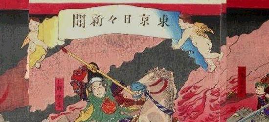
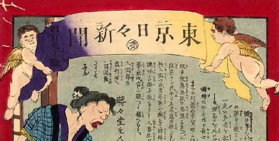
Stage 2 TNS banners October 1874 to August 1875 |
||||
On Stage 2 mastheads the cherub on the left is looking more toward us with a full face but slightly downcast eyes. 76 prints in the TNS series have banners with this style of cherub -- making it the most common in the series. 35 prints (46 percent) with Stage 2 cherubs have no seals -- twice the percent of Stage 1 prints with no seals. The rest have seals ranging from October 1874 (Meiji 7-10) to August 1875 (Meiji 8-8), and the seal is typically on the left margin. The first masthead shown here, of TNS-984, is typical of Stage 2 mastheads. The story on this print is based on an article published in the Tonichi paper on 13 April 1875, but there is no seal on the print. The other two mastheads represent TNS-491 and TNS-712 (a triptych). Note that both have an Meiji 7-10X (rotated 十 or "10") seal immediately below the title in the center of the title banner. Stage 2 mastheads with sealed bannersA total of 12 TNS prints have Meiji 7-10X seals (rotated 十 or "ten"). All but two of these prints are Stage 2 prints. A total of eight (8) TNS prints show seals on the banner -- and all banner seals are of the Meiji 7-10X type. Seven (7) of the sealed banner prints -- 322, 428, 491, 712 (triptych), 813, 822, and 833 -- have Stage 2 cherubs, while only one (1) -- 748 -- has Stage 1 cherubs.On the four (4) other TNS prints with Meiji 7-10X seals, the seal is on the left red border (the location of most TNS seals) or on in the picture area. Of these, three (3) -- 687, 689, and 9002 (triptych) -- have Stage 2 banners, while only one (1) -- 752 -- has a Stage 1 banner. Thus, in addition to being the only seal to found on TNS banners, Meiji 7-10X seals also all but define the change from Stage 1 to Stage 2 cherubs. |

|
Series 2 TNS prints November to December 1876 |
|
|
|
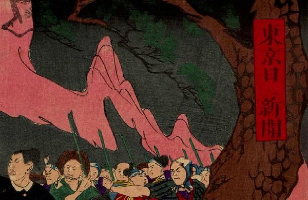
Stage 4 TNS banners November to December 1876 |
||||||
|
There are four nominally Stage 4 prints, all of which are unnumbered triptychs concerning local uprisings at the end of 1876 which proved to be harbringers of the Seinan War of 1877. Three Stage 4 prints (9003-9005) have banners with Stage 2 cherubs but graphically differ from earlier banners -- while one (9006) has neither a banner nor cherubs, but only a cartouche which graphically differs from all of the banners.
RESUME There are only three true Stage 4 TNS prints -- TNS-9003, TNS-9004, and TNS-9006. All are triptychs by Seisai Yoshimura. Two prints, TNS-9001 and TNS-9002, are not true Stage 4 prints but actually Stage 2 prints which did not get numbered for reasons we will consider below. They are included here simply because they have no numbers. One print, TNS-9005, is not a true TNS news nishikie but part of another series. It is included here simply because Tsuchiya has included it with TNS prints on her CD-ROM (Bunsei Shoin 2000).
Stage 4 mastheadsStage 4 prints are not part of the main TNS nishikie project. They were done a year later, by another designer/writer team. For reasons that are not clear, the publisher resurrected Stage 2 cherubs from their shallow grave. So the cherubs on the left of the following Stage 4 triptychs are Stage 2 cherubs. The calligraphy is done with the thinner strokes of Stage 2 banners. All prints in the main series have 日々 (written right to left). The promotional print, TNS-0000, has 日日, like the newspaper.TNS-9003 masthead TNS-9004 masthead AnomalyThe TNS-9003 banner is distinct in that it represents 東京 as 「東亰」 and 日々 as nichinichi as 「日二」(written vertically). |